What actually predicts World Cup success?
Advancing from the group stage

Happy World-Cup-Starts-Today Day! After four years of waiting, the tournament kicks off this afternoon at the Azteca in Mexico City.
Naturally, I spent my morning coffee on the obvious question: who’s supposed to win? The answer, it turns out, is unanimous. Goldman Sachs built a model on twenty thousand matches: Spain. Opta’s supercomputer ran 25,000 simulations: Spain. Nate Silver’s PELE model ran 100,000 simulations: Spain. Eight of nineteen ESPN writers: Spain. The betting markets: Spain. EA Sports simulated the whole tournament inside a video game, and the video game, which has correctly picked four of the last five winners, also: Spain.
So Spain’s going to win?
No, probably not. The field, which refers to the other 47 teams in the tournament collectively, has a much better chance. That’s not surprising. Knockout tournaments are built to humble the best teams, and the FIFA World Cup is no exception. The interesting part is the disagreement hiding underneath. The markets put Spain at about a 15 percent chance to win it all, while Goldman gives them a 26 percent chance. Same team, same evidence, and yet Goldman is 60% more bullish than the broader market. That gap is one of the things this series is about. Over the next month and nine days, as the World Cup drama plays out, I’ll post analyses and share tools that help demystify the beautiful game. Are there really so many good teams that the best one tops out at a 1-in-4 chance to win it all? How do models turn historical data into these sorts of probabilities in the first place? And why is Goldman so much more bullish on Spain than people betting real money?
Data Sciencing the 2026 World Cup
Let me introduce myself and explain why I’m writing this series.
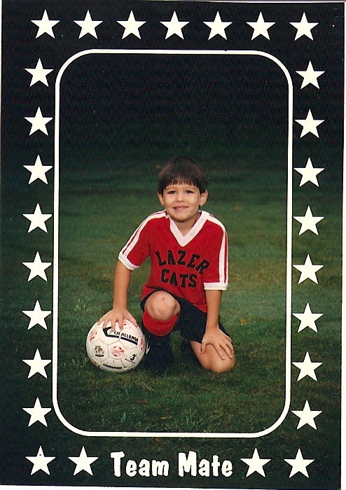
First, I love soccer, and I know it well. I started playing when I was young, as a defender for the mighty Lazer Cats (pictured, with my best ball-on-knee scouting photo), then kept playing through college (also pictured — I’m the one helpfully circled), and never really stopped.

Second, I know and love data too. I have a PhD in cognitive science and a MS in statistics from Stanford, and I spent the first part of my professional life as a professor teaching statistics at Oberlin College. After tenure (and Covid), I transitioned to a role in industry as a data scientist, where I’ve spent the last five years building models, analyzing data, and interpreting the results for product and growth teams in tech.
My plan is to take this year’s tournament as an opportunity to bask in the joy of soccer and data with you, to use it as a month-long excuse to explore how we can ask better questions with data.
Question 1: Which pre-tournament signals are most associated with advancing from the group?
I’ll start with one of the simplest tools in the box: the correlation. Correlations are a useful first pass because they answer basic questions about relationships between variables. We’ll use them to zoom in on two things. First, which pre-tournament features are related to advancing from the group at all? Second, which features mostly repeat information we already have? Before we build anything fancy, we need to know which signals are carrying useful information and which ones are just echoes.
One caveat before we start: the tournament is set up a little differently this year. The field has expanded from 32 to 48 teams. As with the past, each team plays in a group of four. What makes this year different is that in addition to the top two teams in each group, third place finishers in 8 of the 12 groups will also advance to the first round of the knockout stage. That means two in every three teams survive where, historically, only half made it through. So 2026 is an easier exam, graded on a more forgiving curve.
To understand what that might change, we first need a baseline: what predicted group-stage survival under the old format?
The backbone of the analysis is a public archive of 49,329 international matches going back to 1872: who played, where they played, the score, and whether the match was a friendly, a qualifier, or part of a tournament. For the World Cup itself, I’ll focus on the 32-team era, from 1998 through 2022. Here are the pre-tournament signals we can measure before kickoff.
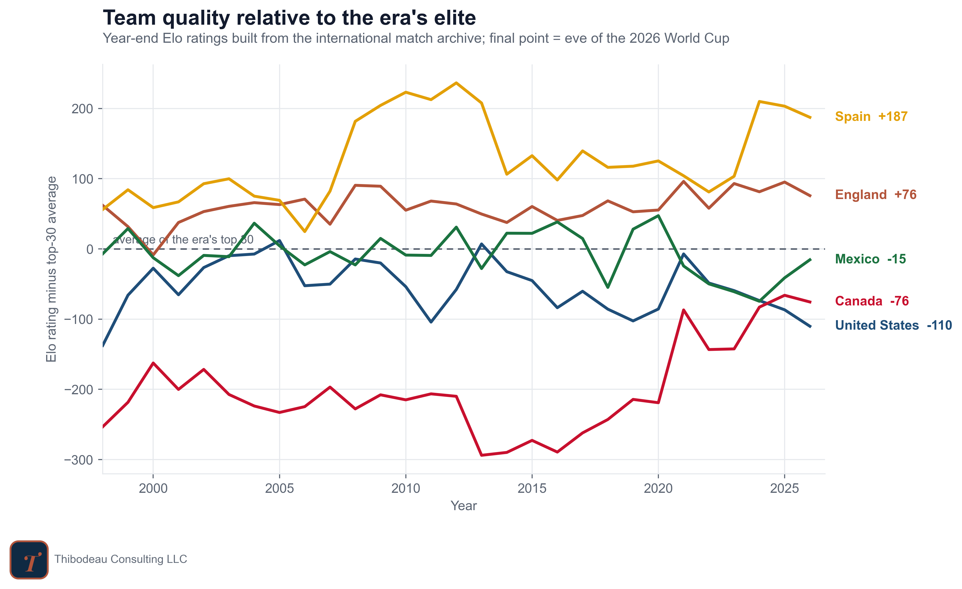
Long-Run Team Quality. The first feature is long-run team quality: a single running score for every national team, built from its entire match history. Think of it as the answer to “how good has this team generally been?” as of the eve of the tournament. We use an Elo-style rating, the same family of system chess uses to rank players. Every international match moves the number, and the size of the move depends on the surprise: beat a team you were supposed to beat and you gain a point or two; lose a match you were heavily favored to win and you give up a chunk. The chart below shows how that score has moved since 1998 for the three hosts, the consensus favorite, and England.
Recent Form (Competitive & Friendly). Recent form asks a narrower question: how has the team played in the final stretch before the World Cup? Teams play two kinds of matches in that stretch, so I compute form separately for each. Competitive matches are tournament games and qualifiers, where the result counts for something. Friendlies are everything else. I split them apart because I wanted to test whether the games that "don't count" actually help predict the games that do. For both groups, form is measured the same way: goal differential per game over the year before the tournament.
Tournament Context. Finally, tournament context covers facts about the team’s situation entering the World Cup, not just its recent performance. This includes whether the team is hosting, whether it is the defending champion, whether it missed the previous World Cup, how many times it has played in the tournament, and which confederation it comes from: UEFA, CONMEBOL, CAF, AFC, CONCACAF, or OFC.
These variables capture things the ratings may not fully absorb. Hosting can matter because of crowd support, travel, climate, familiarity, and officiating pressure. World Cup experience may matter because some teams are more accustomed to the tournament environment. Confederation may proxy for style, qualification difficulty, travel, or differences in the international calendar.
As the series develops, we’ll look at a few additional metrics as well. We’ll develop a more sophisticated measure of recent form, for example, that takes into account the quality of opponents and expectations about performance. We’ll use market odds as a kind of gauge to figure out the value of different information.
Which features track group-stage advancement best?
Before I dive in, which of these factors would you expect to matter most? That is, would you expect to find the strongest relationship between group-stage performance and which of the following five features?
Got your pick? Good. To check it against the data, let’s run some correlational analyses. A correlation is a simple measure of how two variables move together. A positive correlation means higher values of one variable tend to come with higher values of the other. A negative correlation means higher values of one tend to come with lower values of the other. A correlation near zero means there is no obvious straight-line relationship.
In this case, one of the variables is a little unusual: the outcome, advancing out of the group, is yes/no rather than continuous. That’s fine. A correlation with a binary outcome is still interpretable: it tells us whether teams with higher values on a feature were more likely to advance. It is not a causal claim, and it is not a full prediction model. It is a first-pass signal check. The map below shows how every feature relates to every other feature, and to the outcome we care about.
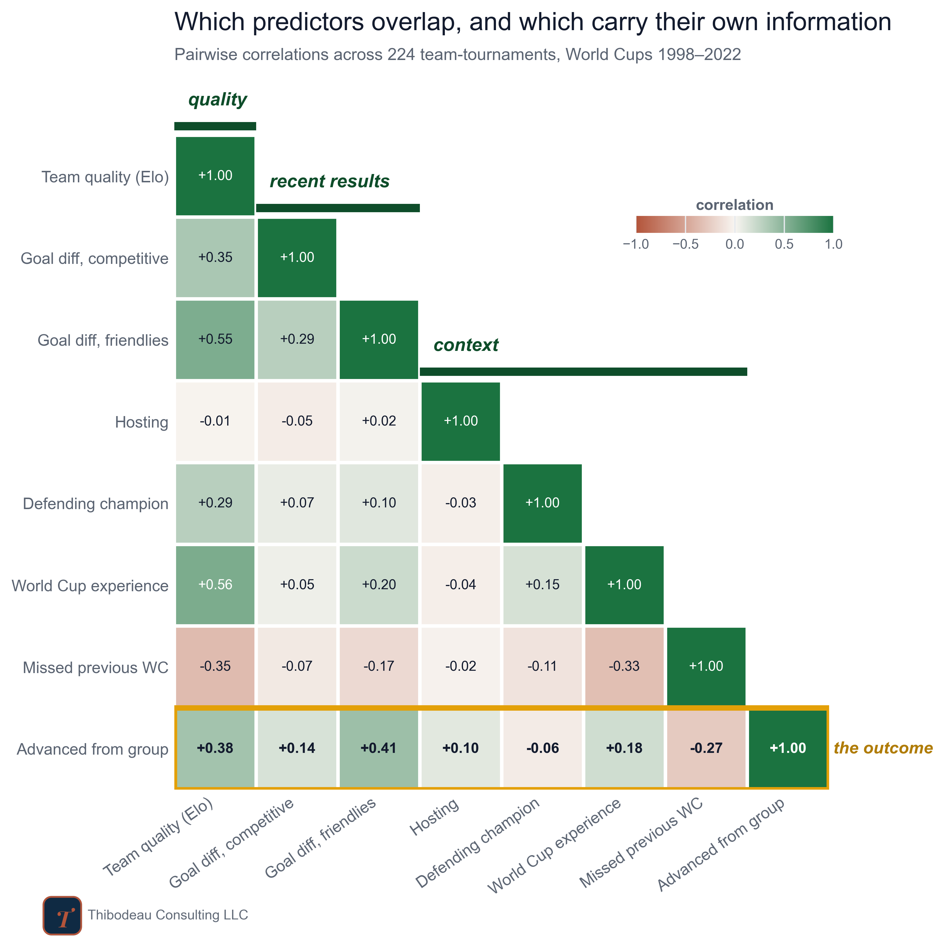
Each cell in the map is a correlation between two numbers, calculated across all 224 team-tournaments from 1998 through 2022. Green means the two numbers tend to rise together. Red means one tends to be high when the other is low. Darker colors mean stronger relationships.
The diagonal staircase shows how the features cluster. Team quality sits first. Recent results come next. Tournament context follows. The gold row at the bottom is the row to focus on: it shows how each feature relates to the outcome we care about, advancing out of the group.
A few patterns stand out. First, recent results overlap with long-run quality. Goal Differential in friendlies correlates +0.55 with team quality, which is high. That makes sense: good teams tend to outscore opponents no matter which matches you count. So if a team has a great friendly goal differential, part of what we are seeing may simply be that it was already a good team.
Second, the gold row shows that both long-run quality and friendly goal differential are related to advancement. Team quality correlates +0.38 with advancing from the group. Friendly goal differential is slightly higher, at +0.41. That does not mean friendlies are magic, or that friendly goal differential is the secret key to the World Cup. It means something more useful: the games that “don’t count” may contain information our basic team-quality rating misses.
Third, compare friendlies to competitive matches. Goal differential in competitive matches, the games with real stakes, correlates only +0.14 with advancement. My guess is that the final year before a World Cup is a strange window. Competitive fixtures are often qualifiers, and for strong teams those qualifiers can be badly mismatched. Running up the score may tell us as much about the schedule as the team. Friendlies are scheduled more deliberately, and strong teams often use them to test themselves against other strong teams. The exhibition might be the fairer test.
That is the larger lesson from the map. Some numbers are useful because they summarize team quality. Others are useful because they add something different. The goal is not to find the one true predictor. It is to separate signals that repeat what we already know from signals that bring in something new.
One more cell worth a squint: defending champion correlates +0.29 with team quality but -0.06 with advancing. Champions are strong teams that, somehow, do not advance like strong teams. We’ll hold that thought for a later post.
Where This Goes Next
Today is the kickoff: four families of features, one outcome, and a first look at which signals track it and which ones just repeat each other. The correlations already start to tell a story, but correlations are one-at-a-time tools. The real test is what happens when a model has to weight different types of evidence together.
That is tomorrow’s post. I’ll start to explore how we can take these individual features and build them into a more complex model. From there, a few threads I already know I want to pull. Whether different ways of measuring team strength and form tell different stories, or whether they all collapse into the same signal. Whether the features that mattered in 1998 still mattered in 2022, or whether every World Cup quietly rewrites the rules. And whether fancier models can actually beat the humble logistic regression. The literature says that is harder than it sounds. We’ll find out.
Daily Delivery
Alongside the analyses, I will post game picks for every match, and I’ll track performance over time. Starting tomorrow, the daily picks and grading will be for paid subscribers; if you want to follow along as the scoreboard fills in, that is the place.
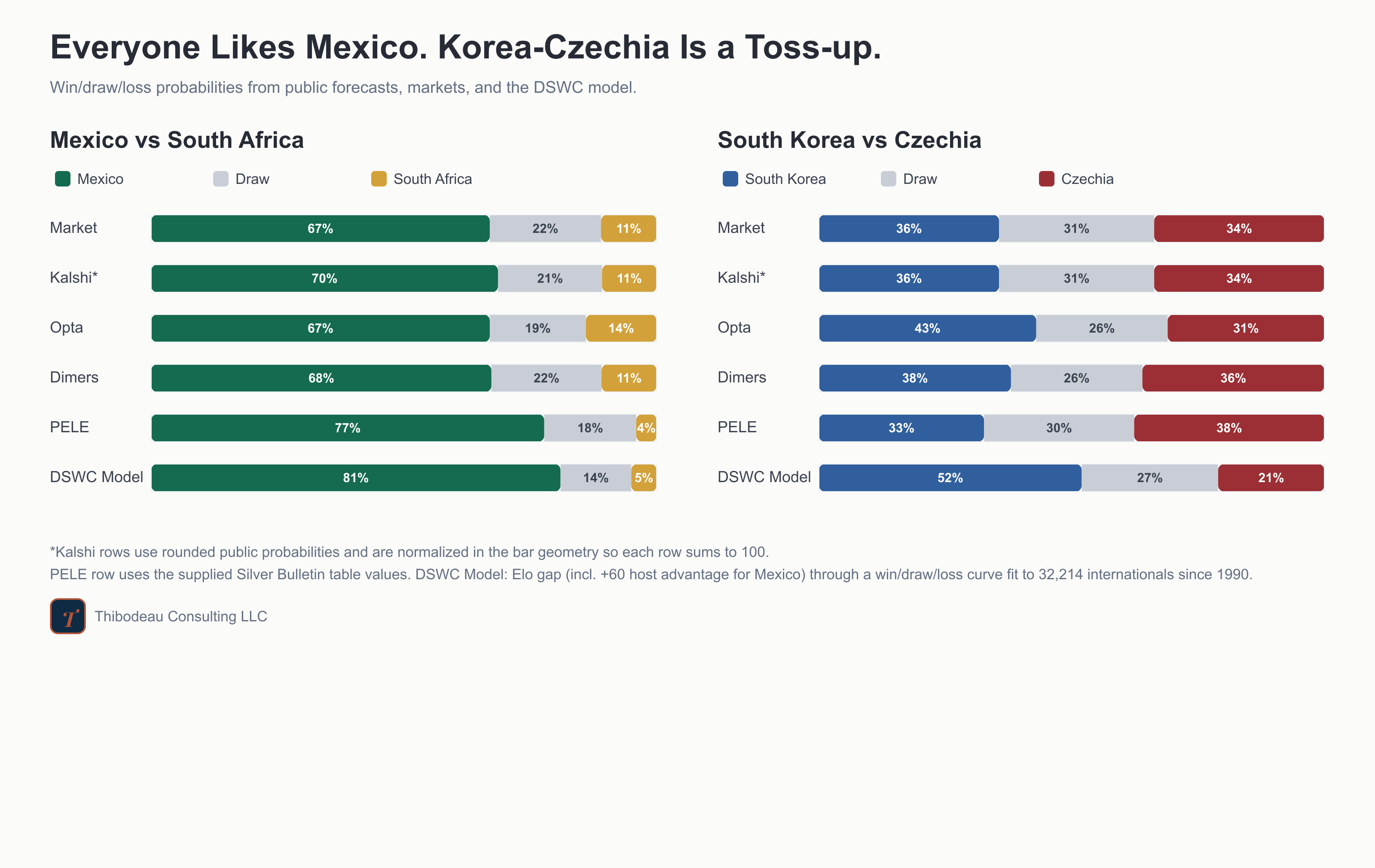
The tournament starts in a few hours. Mexico and South Africa at the Azteca. Spain is the favorite, the favorite will probably lose before the final match, and we have a month to figure out who actually knew something.
Happy World-Cup-Starts-Today Day!