How The World Cup Moves The Internet
What match-day traffic says about screens, schedules, and attention

Day 34. After two days off, the World Cup is back with its first semifinal: France against Spain. Spain entered the tournament as favorites. Now they are underdogs, with France favored both today and to win it all.
Before kickoff, we look at how the World Cup shapes human behavior through streaming data. A live match produces a stream of information not just about the play, but about the people watching.

Question 34: What can streaming data tell us about human behavior?
So far, we have mostly pointed the camera at the field. Teams, players, goals, travel, heat, knockout pressure. The usual World Cup machinery. Today, we turn it around.
The World Cup is not just a sporting event. It is a network event. When a match kicks off, fans make millions of small choices: which app opens, which screen gets used, whether people watch at home or at work, whether the game becomes background noise or the center of the day.
Those choices leave traces, especially in internet streaming data, which can show us when attention arrives, where it goes, and how quickly it can shift.
For this post, Plume, a cloud-managed network-intelligence platform used by internet providers, shared aggregated streaming data from three games, giving us a rare view of the World Cup from the other side of the screen in a three-match case study.
So what does a global tournament do to the internet, and what does that reveal about us?
The World Cup moves audiences and streaming shows us where
Start with the simplest question: did match days change streaming behavior? Yes, but not as if a single switch had flipped.
Across the three matches from Plume’s sample, Peacock traffic rose every time. Peacock streams Telemundo’s Spanish-language coverage of every match, giving it a direct path to World Cup demand. Traffic increased 54 percent for Mexico-South Africa on opening day, 53 percent for USA-Paraguay in prime time, and 18 percent for USA-Australia on the afternoon of June 19.
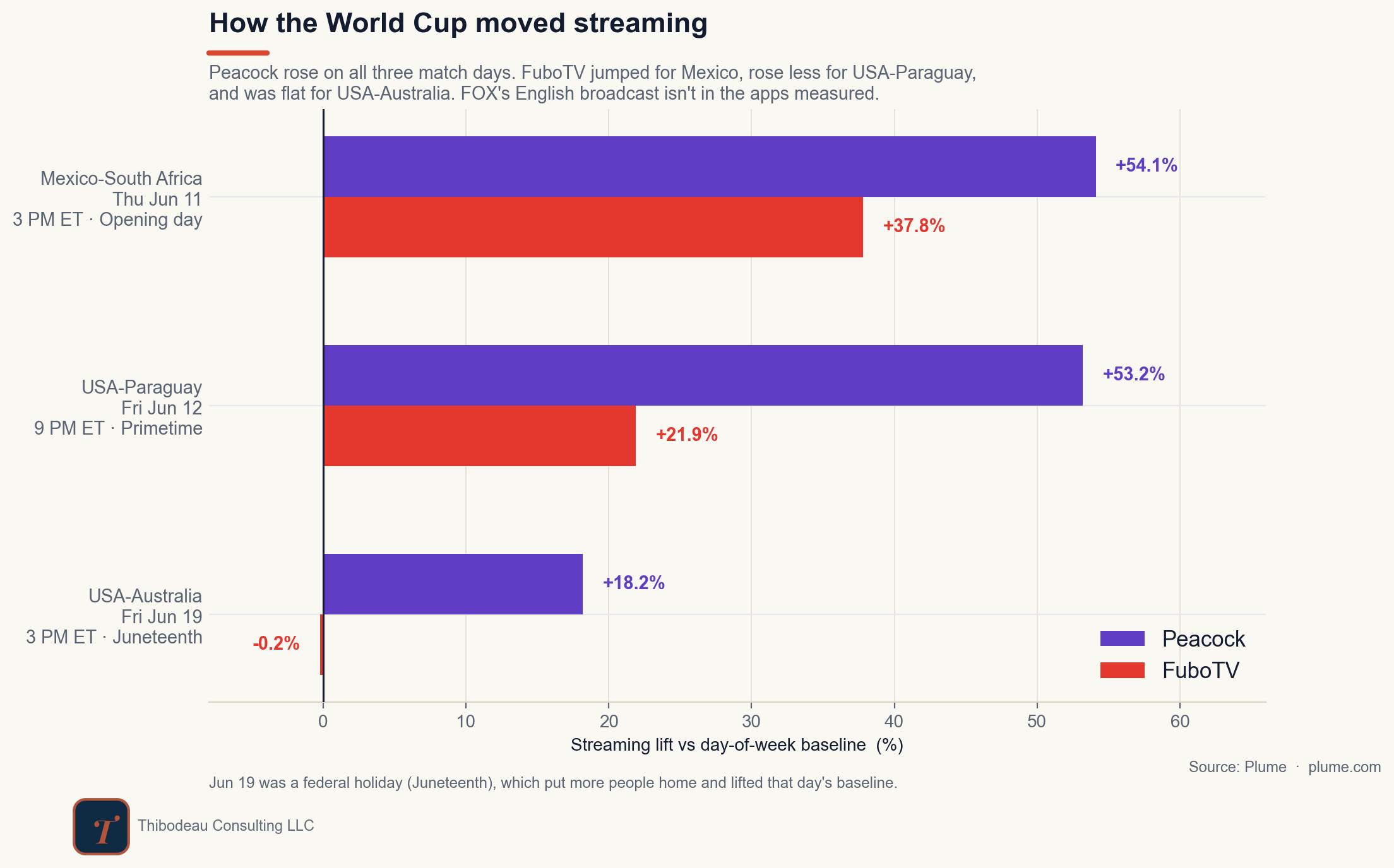
The lift was real each time, but much smaller on June 19. One likely reason is the calendar: June 19 was Juneteenth, a federal holiday. Because lift is measured against a baseline, higher ordinary streaming on a holiday afternoon would make a comparable World Cup audience register as a smaller percentage increase. The data cannot isolate that effect, but every platform’s June 19 result should be read against it.
FuboTV fills out the picture. Traffic jumped 38 percent for Mexico-South Africa and 22 percent for USA-Paraguay, but barely moved for USA-Australia. Because Fubo carried all three matches, availability alone cannot explain the difference. The stronger response for the first two games is consistent with Fubo’s strength among Spanish-language sports audiences.
Fox also carried all three games in English, but Fox app traffic is not included in these data. So Fubo’s quiet June 19 bar does not mean the U.S. audience disappeared. It means this particular slice of the internet captured the World Cup most clearly through a Spanish-language streaming path, while a major English-language path remained outside the frame.
That points to one lesson from the tournament’s distribution model: live sports redirect streaming demand toward the viewing paths that rights holders make available. Rights help determine which apps get opened.
The next question is what happens after viewers find the game. Do they watch on a phone, a television, or a laptop? That depends less on the matchup than on where the match lands in the day.
The clock picks the screen
The screen is where the data starts telling us about people. Mexico-South Africa kicked off on a Thursday afternoon. That is workday soccer, and the viewing pattern looked like it: mobile was the dominant screen, just over half of the measured window. People were fitting the match into the day they already had.
USA-Paraguay was different. It was Friday night, primetime, and the screen shifted toward the television set: big screens gained about five percentage points of share. But phones still led the night at 50 percent. Primetime nudged the country toward the couch; it did not get everyone there.
USA-Australia complicates the pattern in a useful way. It was another afternoon match, but it fell on the Juneteenth holiday. Big screens dominated at 82 percent. That does not mean kickoff time stopped mattering. It means the calendar changed what 3 PM looked like. The holiday raised the viewing floor, and the match played more like a living-room event than a workday interruption.
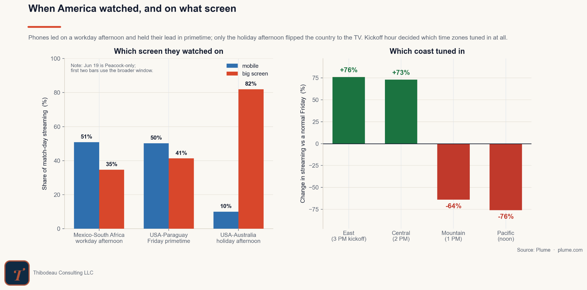
The time-zone split makes the point sharper. USA-Australia kicked off at 3 PM Eastern, which meant 2 PM Central, 1 PM Mountain, and noon on the West Coast. Same match, same platform, same country, but the internet did not move the same way everywhere. In the East and Central time zones, streaming surged: up 76 percent in the East and 73 percent in Central, compared with a normal Friday. Farther west, the pattern flipped. Mountain was down 64 percent. Pacific was down 76 percent.
The “new audience” numbers tell the same story from another angle. On Peacock, 44 percent of the locations streaming USA-Australia had not streamed anything in that 11 AM to 6 PM window on any of the six prior Fridays. That does not mean 44 percent were new subscribers, or even new Peacock users. It means the World Cup pulled people into a viewing window when they do not typically stream television.
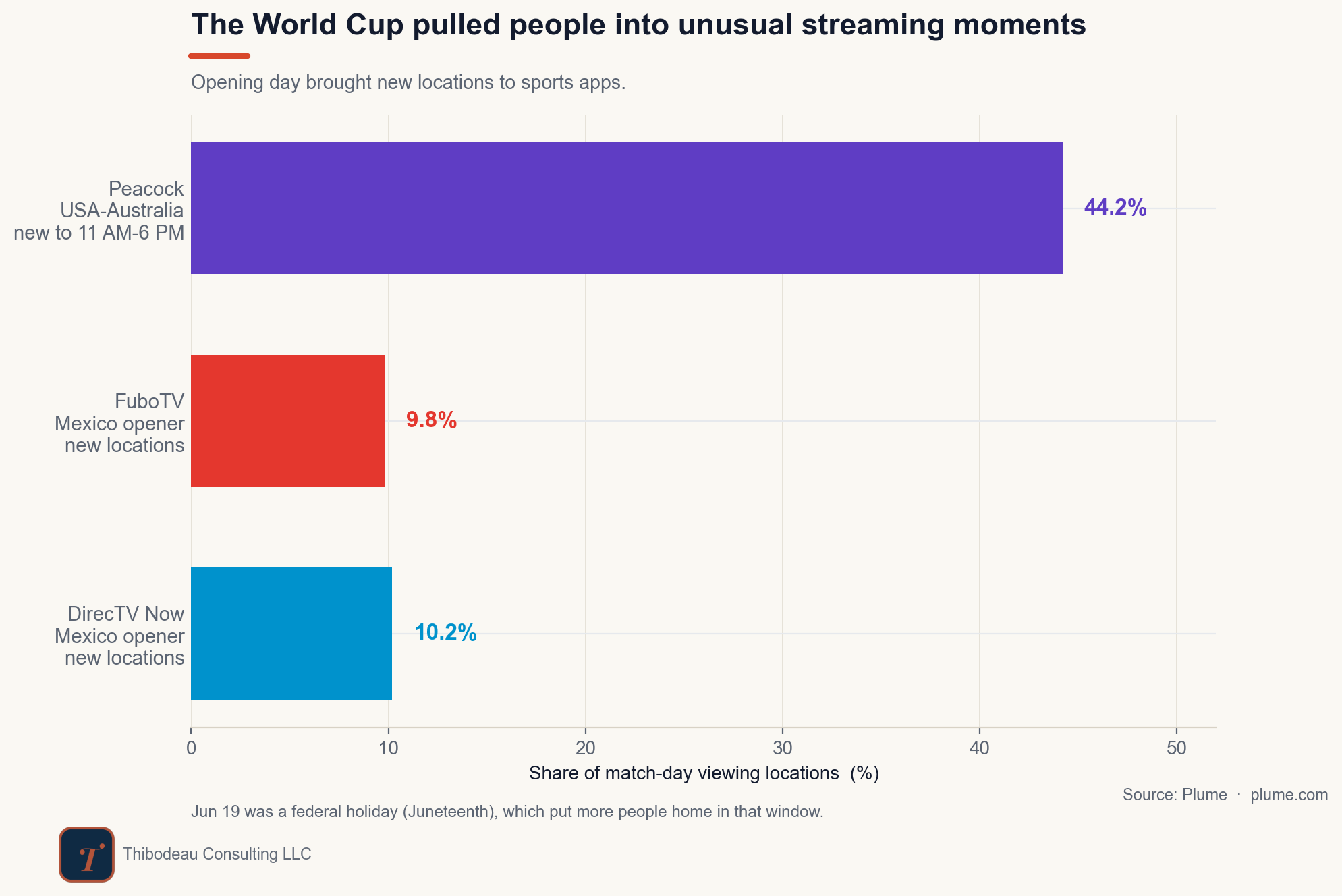
In other words, the calendar and clock pick the screen. They matter because they shape where people are when they watch. National TV treats kickoff as one time, but human behavior depends on context. The same game can land as afternoon viewing in one part of the country, a midday interruption in another, and an unusual streaming moment for people who normally would not be watching at all.
A national match still lands locally
The same idea shows up one level lower. Time zones split the country, but ISP networks split it even further.
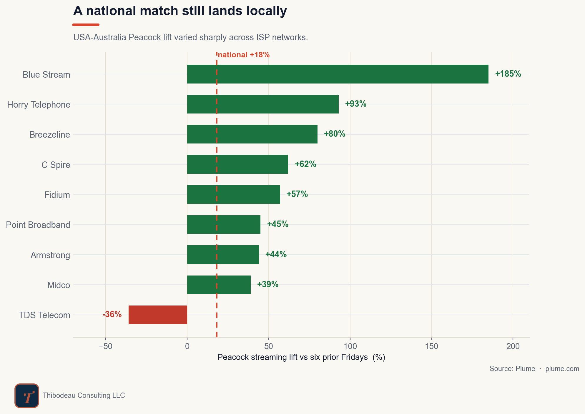
For USA-Australia, the national Peacock lift was 18 percent. But across individual ISP networks, the spread was much wider, as shown in the plot below. The biggest percentages come from small regional networks, where a modest number of extra homes reads as a huge swing; the mass-market carriers sit closer to the national line. The point is not any single network’s number. It is that one national figure hides a wide spread.
That is what makes network data different from a TV rating. A rating tries to compress the country into one number. The network shows the unevenness underneath it. Rights matter, kickoff time matters, device behavior matters, and local customer bases matter too.
The weirdest finding: streaming fell after kickoff
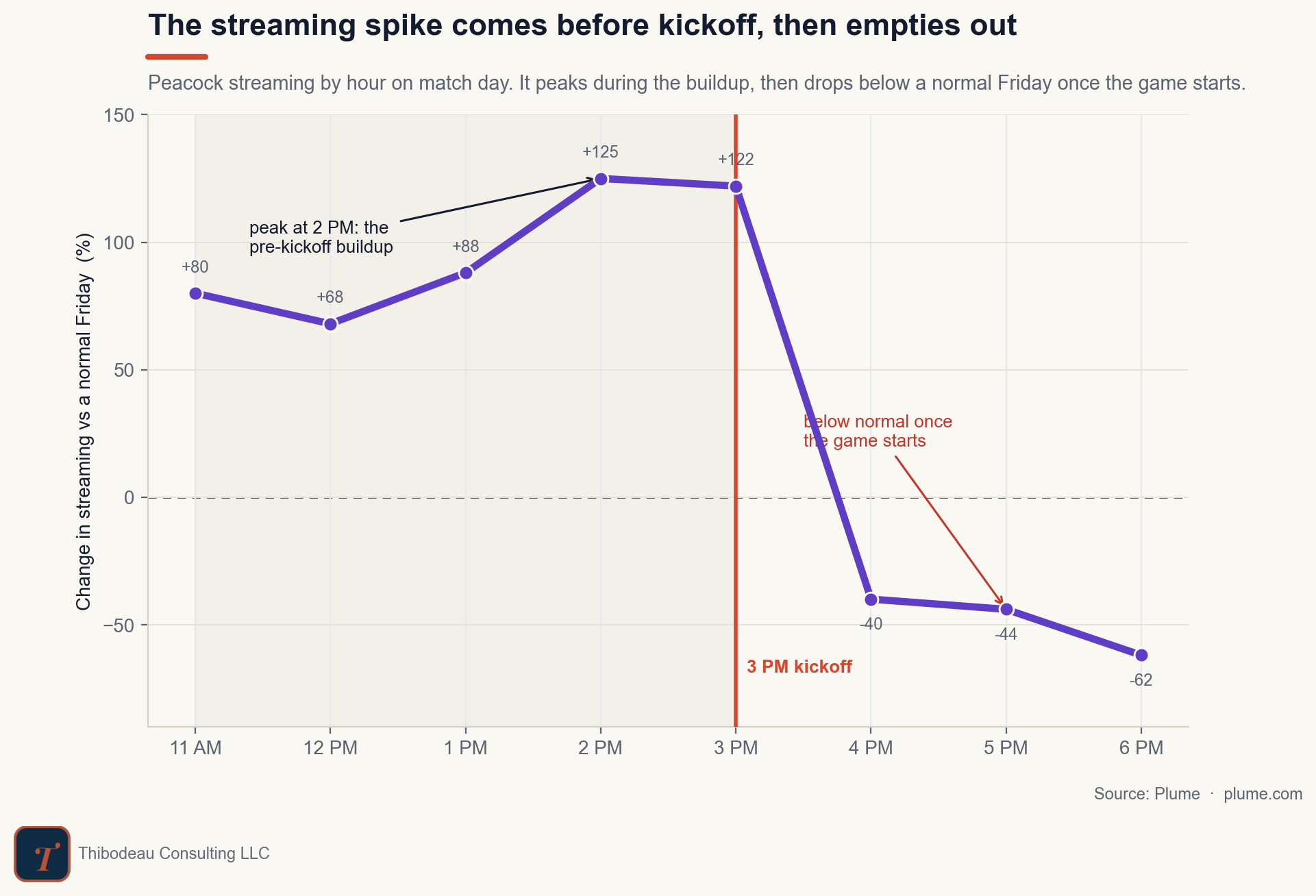
The strangest pattern comes from the hour-by-hour view. For USA-Australia, Peacock streaming built all morning. It was already well above a normal Friday, was already up 80 percent by 11 AM and peaked around 2 PM, one hour before kickoff. At 3 PM, with the match starting, streaming was still up more than 120 percent.
Then it fell. By 4 PM, Peacock streaming was below a normal Friday. By 6 PM, it was down more than 60 percent. That sounds backwards. The game had not become less important after kickoff. It had become the main thing.
The likely explanation is that streaming sessions are not the same as attention. Before a match, people browse, test apps, put pregame coverage on, and move between devices, which spins up separate streams. Once the game begins, those sessions consolidate. We cannot see the living rooms from this data, but the device split points the way: big screens carried 82 percent of this game, so many of those scattered pregame streams likely collapsed onto a single shared TV. The network counts sessions, not people, so it sees fewer streams even as the match becomes more central to the day.
So here is the answer to the question we started with: the internet does not just show us the game. It also shows us the audience arranging itself around the game, screen by screen, hour by hour. Sometimes the strongest sign of attention is not more streams. It is fewer streams on bigger streams.
Today’s Forecasts
The full scorecard, forecasts for the games still to come, and live tracking of the Golden Boot race can all be found on the DSWC dashboard here.
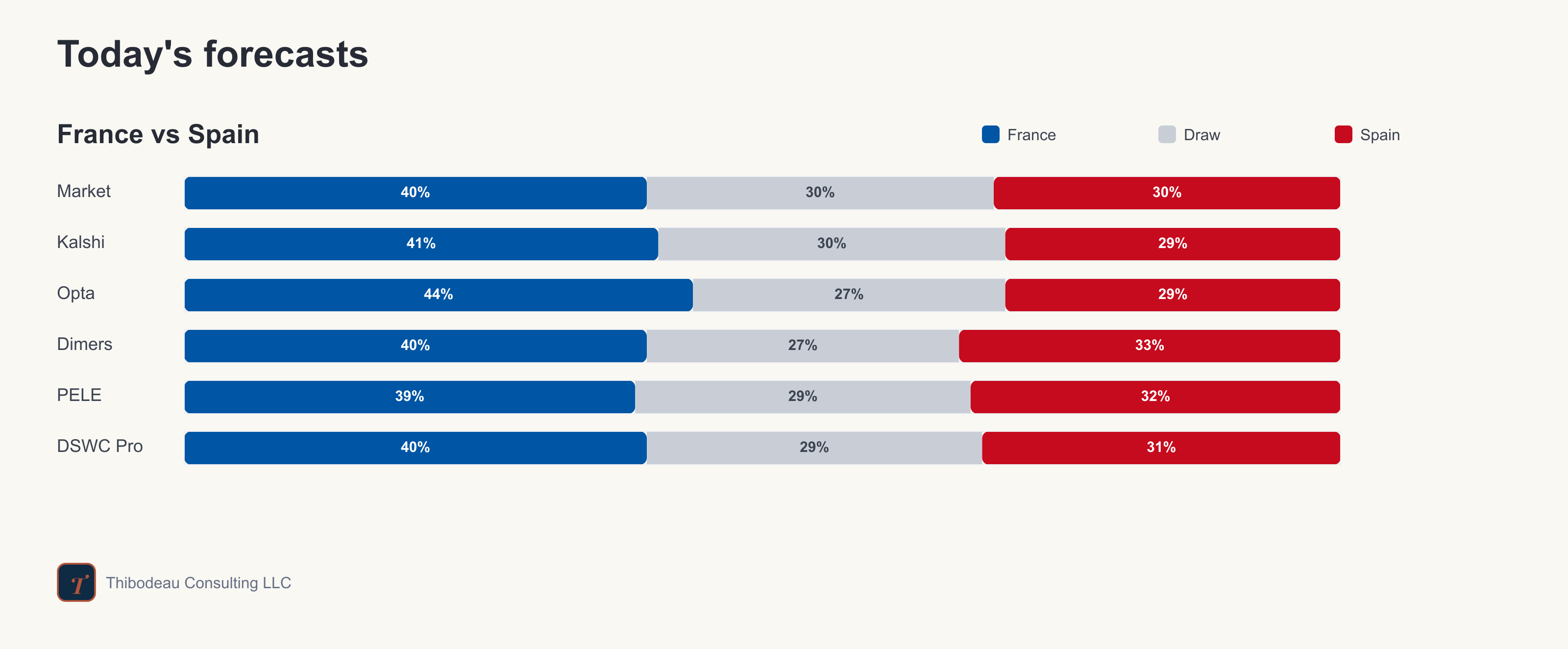
Today’s forecast bars are below. France-Spain is tight, but every forecaster has France in front. The market puts them at 40 percent to win in 90 minutes, with Spain at 30 and the draw at 30. Opta is the most France-friendly at 44 percent, while Dimers gives Spain the best chance at 33 percent.
The real story is the draw risk. Every model has this close to a one-in-three chance of being level after 90 minutes, which fits the matchup: two elite teams, little separation, and a semifinal where the favorite is real but not overwhelming.