How Do You Grade a Forecast?
Why being right is not the same as being well-calibrated

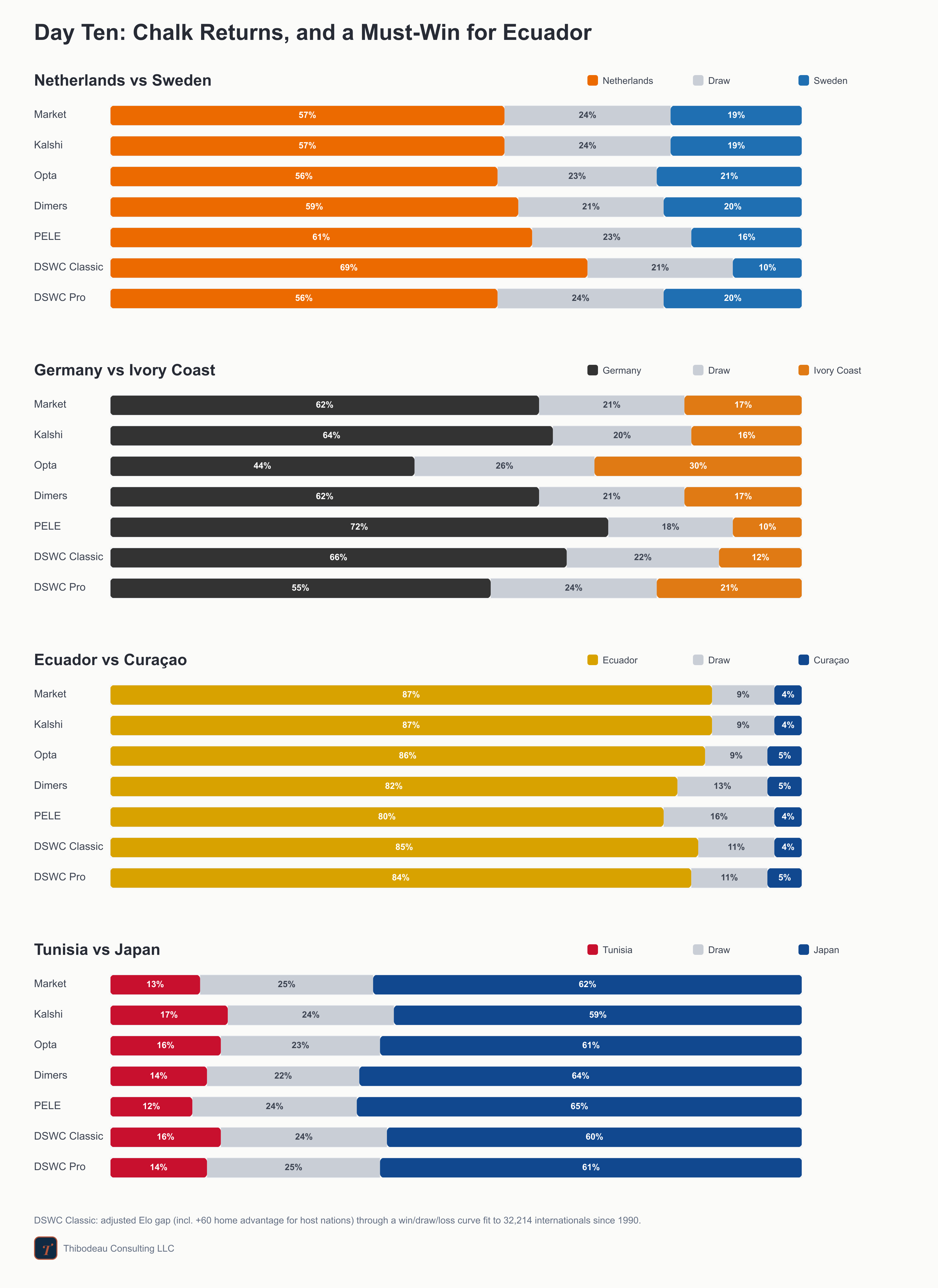
Day ten, and the favorites are back in the spotlight. The Netherlands meet Sweden in Houston, Germany and Ivory Coast play what feels like a group decider in Toronto, Ecuador and Curaçao meet in a win-or-go-home match in Kansas City, and Tunisia-Japan closes the night in Monterrey. We are now 31 games in, which makes today a good day for a basic question: how do you actually grade a forecast? But first, a quick recap.
Previously, at the World Cup
Day nine belonged first to the United States, which beat Australia 2-0 for a second straight win and became the first team to clinch a spot in the knockouts. Then Morocco beat Scotland 1-0 and Brazil handled Haiti 3-0, making Haiti the tournament’s first team out. In the night’s final match, Paraguay upset Turkey 1-0 on the fastest goal of the tournament, barely a minute in. Taken together, a neat reminder of why grading probabilities is tricky: one day can serve up a bad miss, a good lean, an easy favorite, and a coin flip that lands the wrong way.
Question 10: How do you grade a probability?
By now we have two kinds of prediction floating around this newsletter: match forecasts, which say how likely each team is to win, draw, or lose today, and group forecasts, which say how likely each team is to survive the first round. Both are probabilities, and that means both create the same awkward problem. How do you grade a prediction that was never supposed to be certain?
This is the strange thing about probability. A 30 percent event is supposed to happen. Not most of the time, but often enough that you should not act shocked when it does. When Spain, a nine-in-ten favorite, was held to a 0-0 draw by Cape Verde, every forecaster on our board “missed.” But that draw was not a freak. The market had priced it at roughly one in ten, and one-in-ten things happen constantly. The interesting question is not whether anyone called it. It is whether they gave the draw the right amount of room. To make sense of that, we need a scoreboard for uncertainty.
“Called it” is the wrong test
Start with the crudest possible score: did you pick the winner? It feels natural, but it grades almost nothing here, for two reasons. First, it scores what the forecasters already agree on. In nearly every match, they back the same favorite, so “did you call it?” hands most of them the same mark. Second, it throws away the one thing they actually disagree on, which is also the one thing a probability forecast is for: confidence.
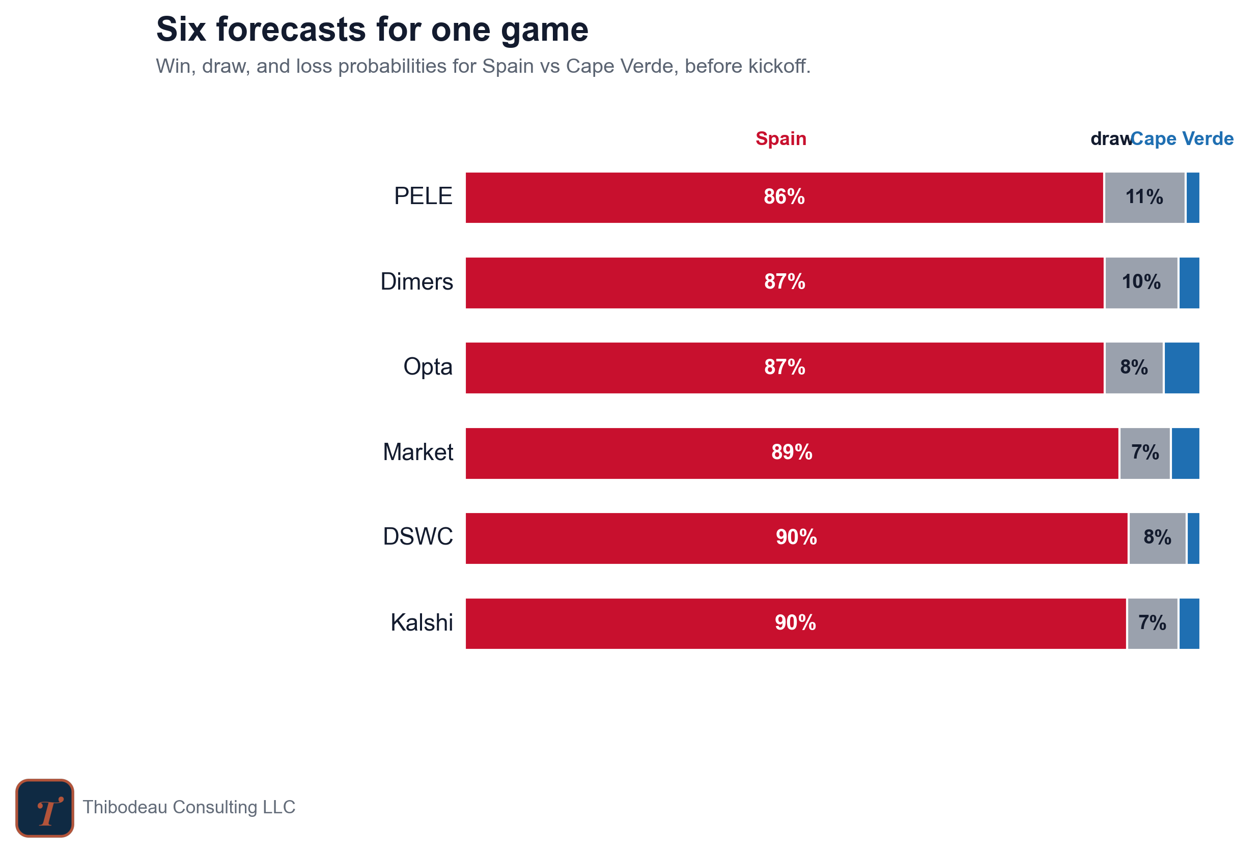
Spain-Cape Verde highlights that point. Every forecaster picked Spain. Every forecaster was wrong. If we score the match as a simple win-loss prediction, they all get the same grade: miss.
But they did not make the same forecast. PELE gave the draw 11 percent. Dimers gave it 10. The market and Kalshi gave it 7. That difference matters. When the draw actually happened, the forecasters that left more room for it should get punished less. The ones that treated it as nearly impossible should get punished more.
Brier score: the workhorse
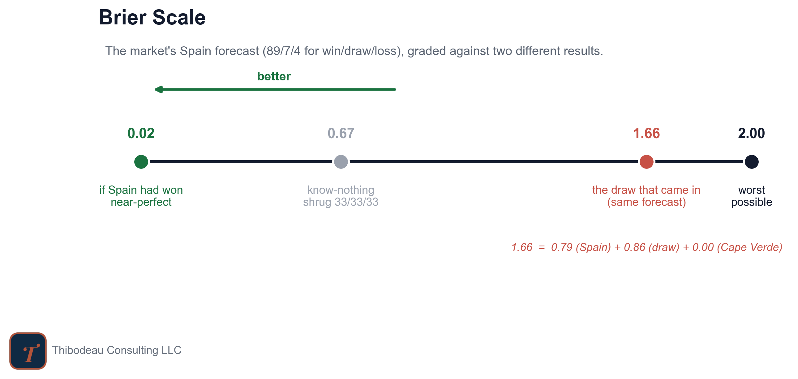
The Brier score is the heart of our scoreboard. It measures the gap between what a forecaster said and what actually happened. For each possible outcome, take the forecast probability, subtract the result, square the difference, and add the pieces together. In a three-way soccer forecast, that means one term for each possible result: win, draw, or loss. For Spain-Cape Verde, the market’s forecast was Spain 89%, draw 7%, Cape Verde 4%. Here’s how that turned into a score when the result came in as a draw.
That is an ugly score, and it should be. The market put 89 percent onto an outcome that did not happen and left only 7 percent for the one that did. PELE was wrong too, but less wrong: it gave the draw 11 percent and scored 1.55. Kalshi was more confident in Spain and scored 1.68. Same result, same picked winner, different probability judgment.
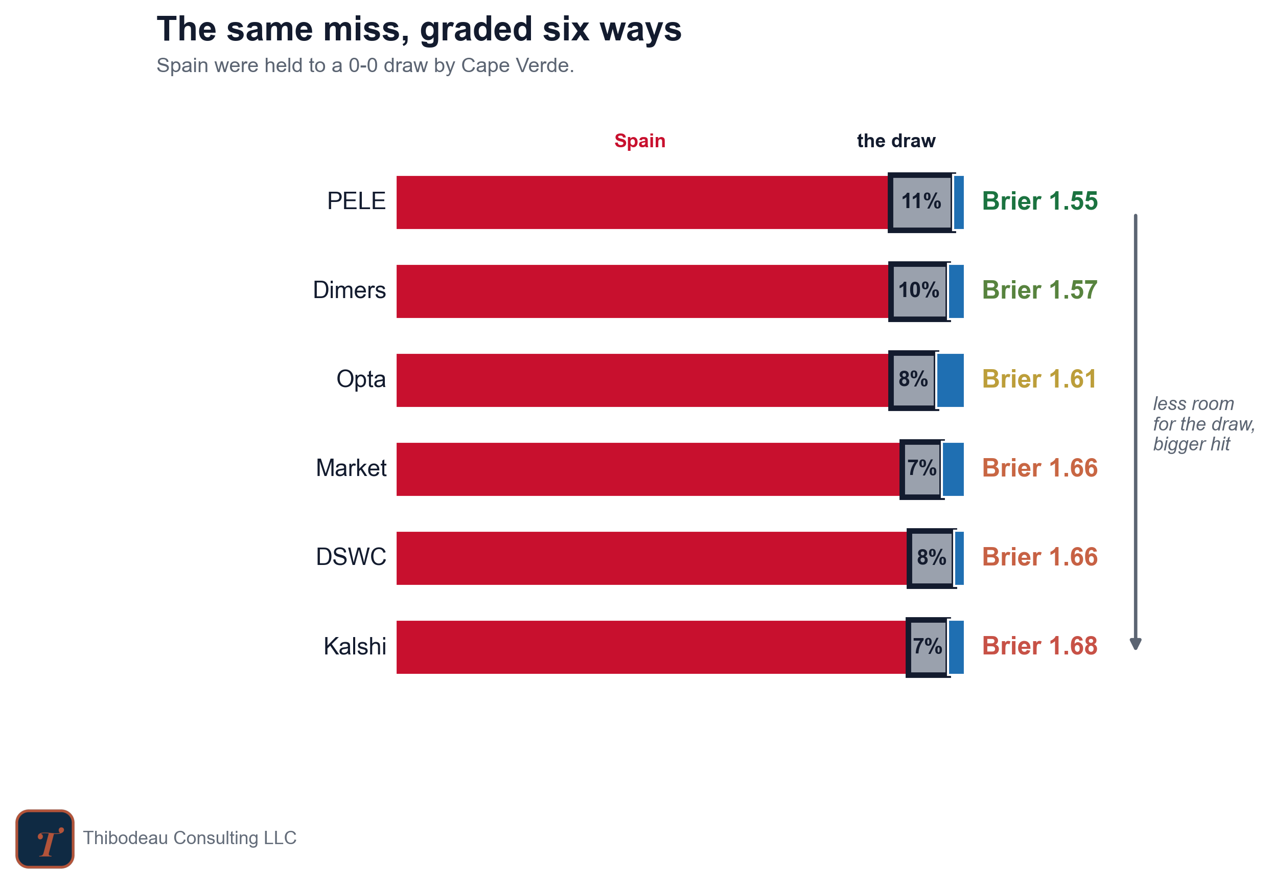
Had Spain won, the market’s exact same forecast would have scored almost perfectly:
Remember that lower is better and giving each outcome equal weight, 33/33/33, scores 0.667 every time. That is the know-nothing line on the scoreboard: the score you get for refusing to have an opinion.
There are two more concepts that help round out our grading story: calibration and sharpness.
Calibration: Do the Numbers Mean What They Say?
Calibration asks whether a forecast’s labels mean what they say. If a model says 70 percent often enough, the event should happen about 70 percent of the time. Not every time. Not in every tiny sample. But over enough forecasts, the label should mean something.
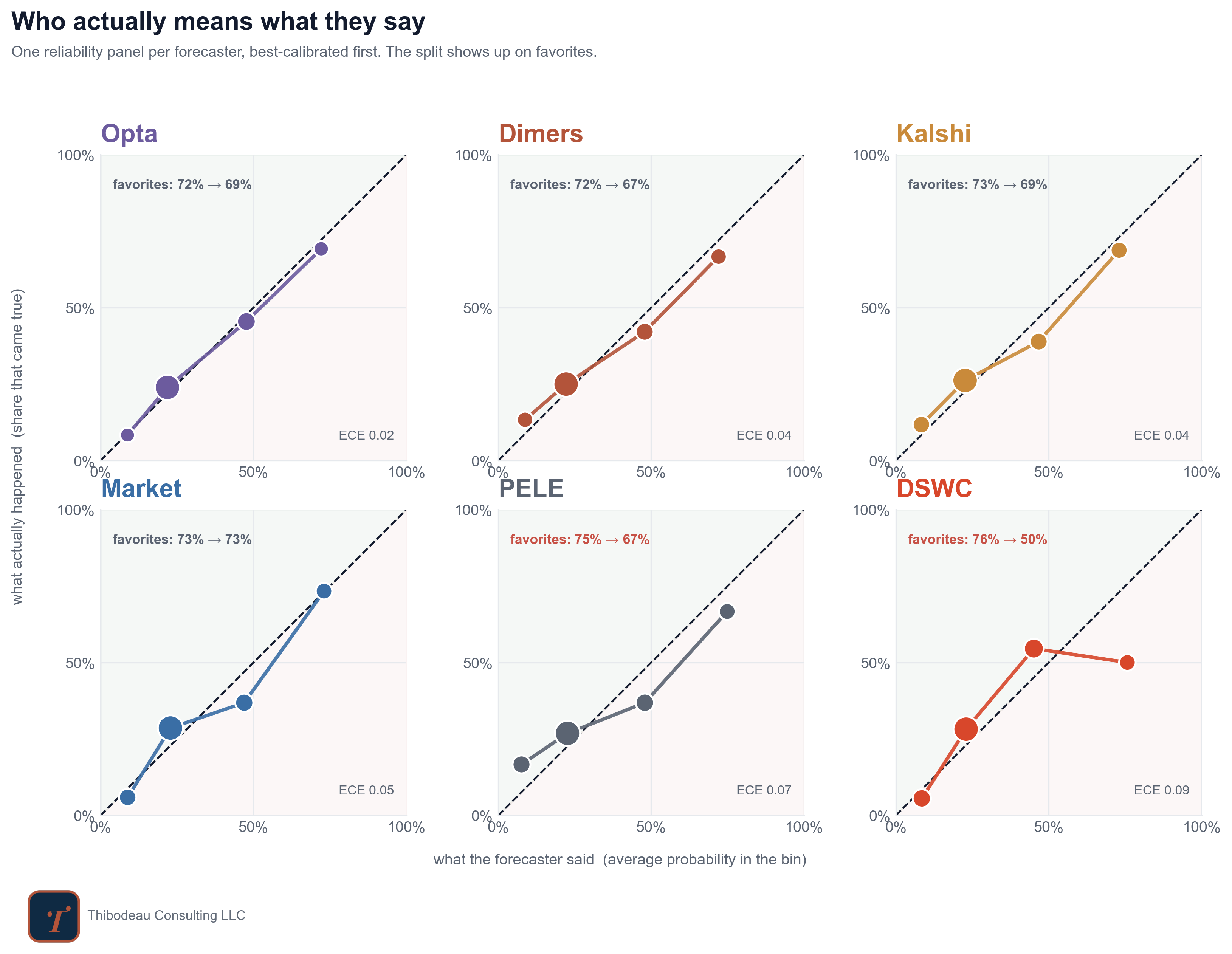
The plot below does that check for the forecasters we have been tracking. Each panel is a reliability diagram. The x-axis is what the forecaster said: the average probability it assigned to outcomes in that bucket. The y-axis is what actually happened: the share of those outcomes that came true. The dashed diagonal is perfect calibration. If the dots sit on that line, 30 percent forecasts happen about 30 percent of the time, 70 percent forecasts happen about 70 percent of the time, and the labels mean what they say.
The first thing to notice is that nobody is wildly lost, but nobody is perfect either. Opta is closest to the diagonal, which is why it shows the lowest calibration error here. The market is also close, especially on favorites: when it made a team about a 73 percent favorite, those teams have won about 73 percent of the time. That is exactly what calibration is supposed to look like.
Our DSWC model tells the opposite story. It has been too confident about favorites so far. When it has made a team about a 76 percent favorite, those teams have won only about half the time. That does not mean the model is useless. It means the labels are too hot. A 76 percent forecast from this model has not behaved like a 76 percent forecast yet.
Two caveats. First, this is still a tiny sample, so these dots can move a lot with the next few games. Second, calibration is not the whole scoreboard. A model can be well calibrated and still too timid, or bold and useful but poorly calibrated. That’s where sharpness comes in.
Sharpness: The Courage to Say Something
Sharpness has the opposite virtue of calibration. It tells us how far a model is willing to move away from the timid baseline and actually commit. This is where forecasts develop personality. Some models are cautious, keeping most games closer to the middle. Others are sharper, more willing to say that one outcome is much more likely than the others. That nerve is exactly how a forecast wins, and exactly how it gets punished. The thing we are chasing is calibrated sharpness: bold enough to be useful, honest enough that the numbers still mean what they claim.
The plot below puts those two virtues on the same map. Left to right is calibration: farther right means the model’s probabilities have been closer to true so far. Bottom to top is sharpness: higher means the model has been more willing to move away from the cautious baseline.
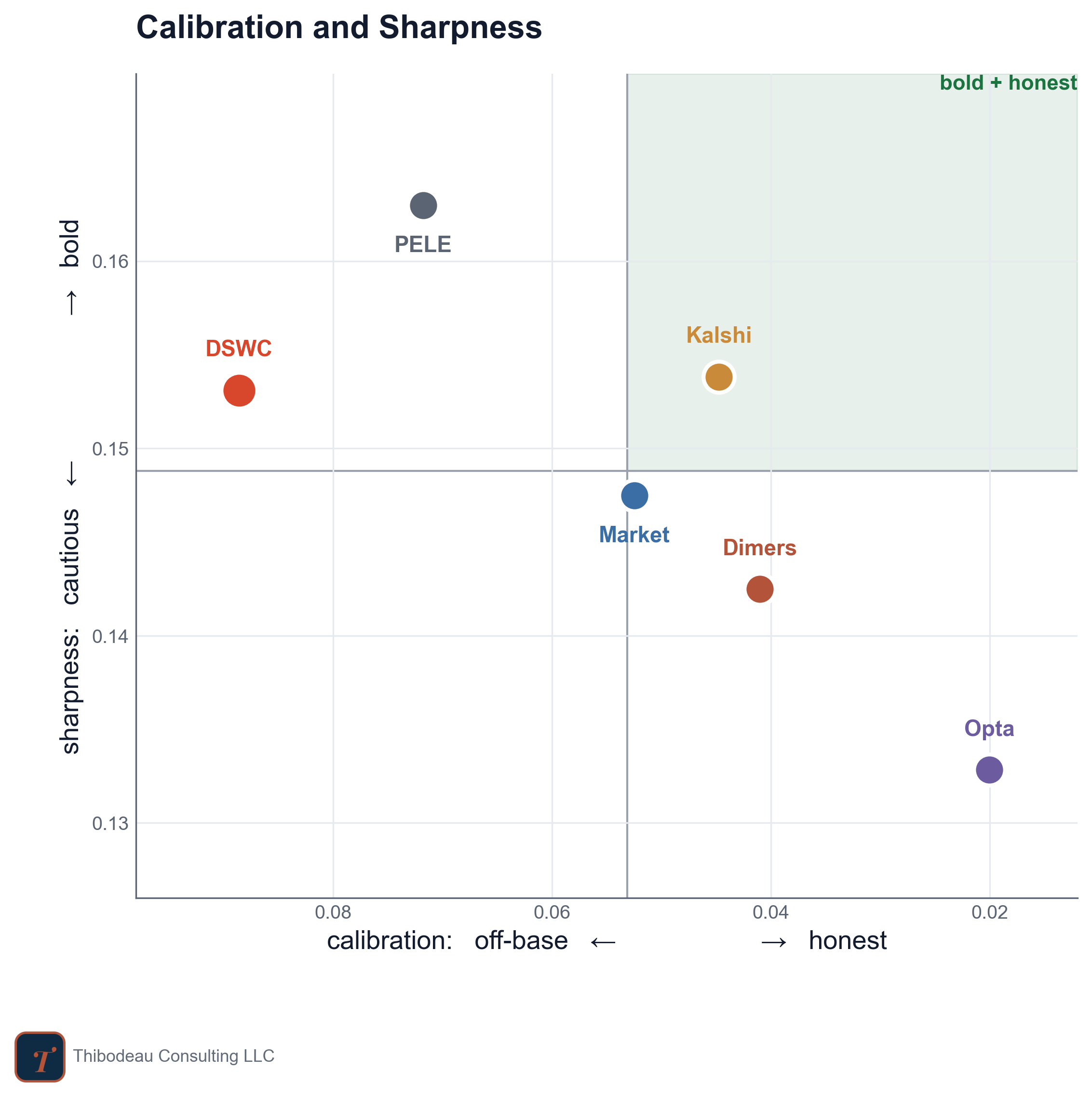
The dream is the upper-right corner: bold and honest. Kalshi is closest to that corner so far, though with a sample this small I would not throw a parade for anyone yet. Opta has been the best-calibrated but also the most cautious. PELE and DSWC have been sharper, but less calibrated. The market sits close to the middle, which is exactly what you might expect from a crowd that is hard to beat but usually reluctant to go too far out on a limb.
That is the tradeoff. Sharpness without calibration becomes overconfidence. Calibration without sharpness becomes a shrug. The scoreboard rewards the forecaster that can live with one foot in each world.
Up Next
Tomorrow we turn from scoring forecasts to analyzing the one every model has to stand next to: the betting market. It is often called the wisdom of crowds, and our scoreboard agrees, since the market has been one of the hardest lines to beat. But that wisdom rests on a few assumptions about who is betting and why. We look at when those hold.
Today’s Scorecard and Forecasts
Yesterday was a good day for the public forecasters and another mixed one for us. The United States and Brazil both won as favorites, Morocco rewarded the forecasters that gave them more respect, and Paraguay’s early upset of Turkey hurt everyone. Kalshi had the best day, with Dimers and Opta close behind. Our Classic model was too skeptical of the United States and paid for it, though DSWC Pro held up better.
Through 31 matches, Dimers and Opta are tied at the top at 0.571, with the market barely behind at 0.573 and Kalshi at 0.576. PELE sits at 0.596. DSWC is still last at 0.615, but it is now comfortably better than the know-nothing 0.667 line. That matters. The model has been too hot, but it is no longer losing to the shrug.
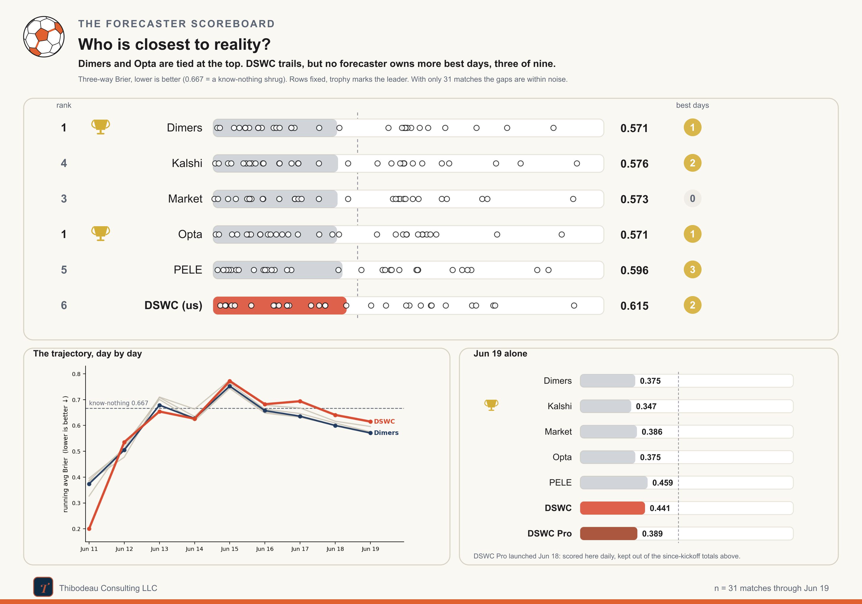
Today’s slate is a useful stress test. The forecasters mostly agree that Ecuador should handle Curaçao and Japan should beat Tunisia. The sharper disagreements come earlier. The Classic model is much higher on the Netherlands than the field, giving them 69 percent against Sweden, while DSWC Pro comes back toward the market at 56. Germany-Ivory Coast is the most interesting split: PELE has Germany at 72, the market and Dimers around 62, Opta only 44, and DSWC Pro at 55. Same match, four different levels of confidence. Which is exactly why we spent today talking about how to grade a probability.