Are Fancy Models Better?
After sifting through the ingredients, we let a few different models cook

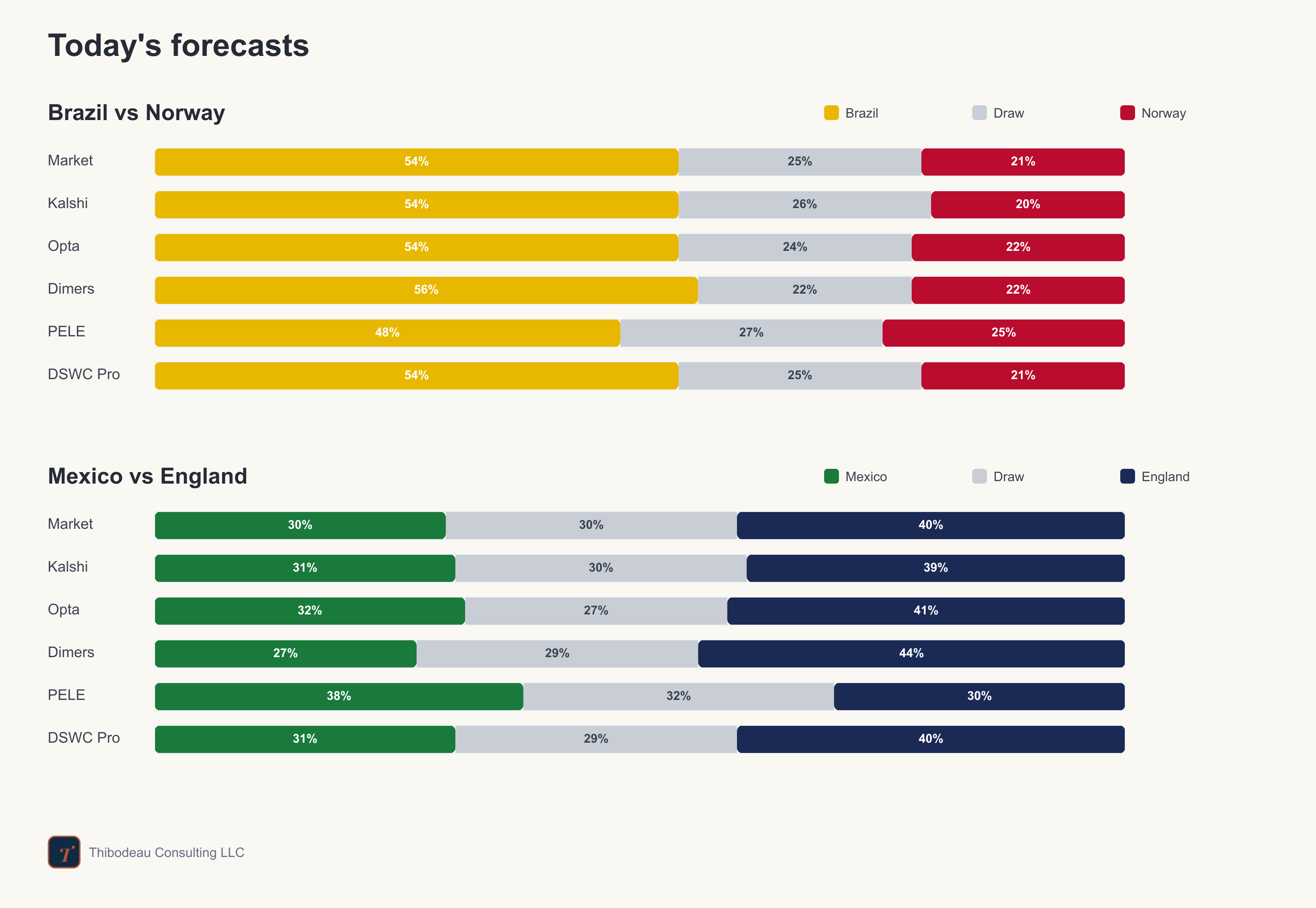
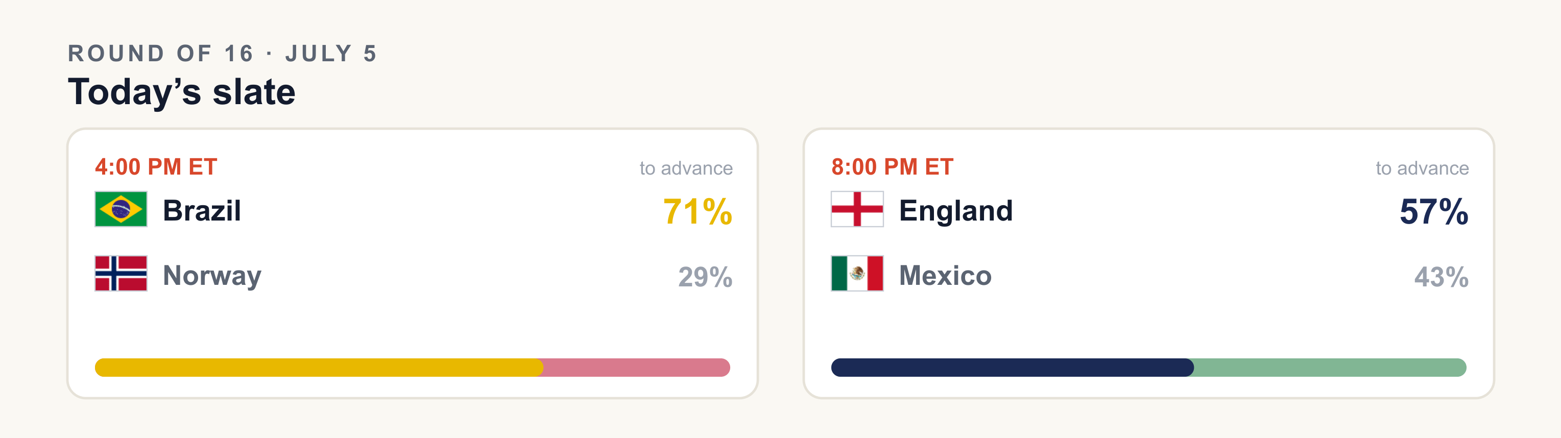
Day 25, and the last day of the holiday weekend gives us Europe against the Americas. Brazil get Norway first: the old South American power, who have been a little overshadowed by rival Argentina so far this year, against Haaland and the team that brought its own food. Then Mexico get England in Mexico City. Mexico have been spotless defensively, while England needed Harry Kane to drag them out of trouble last round. Can he can do it again, at altitude on the host’s home turf? But first, a quick recap.
Previously, at the World Cup
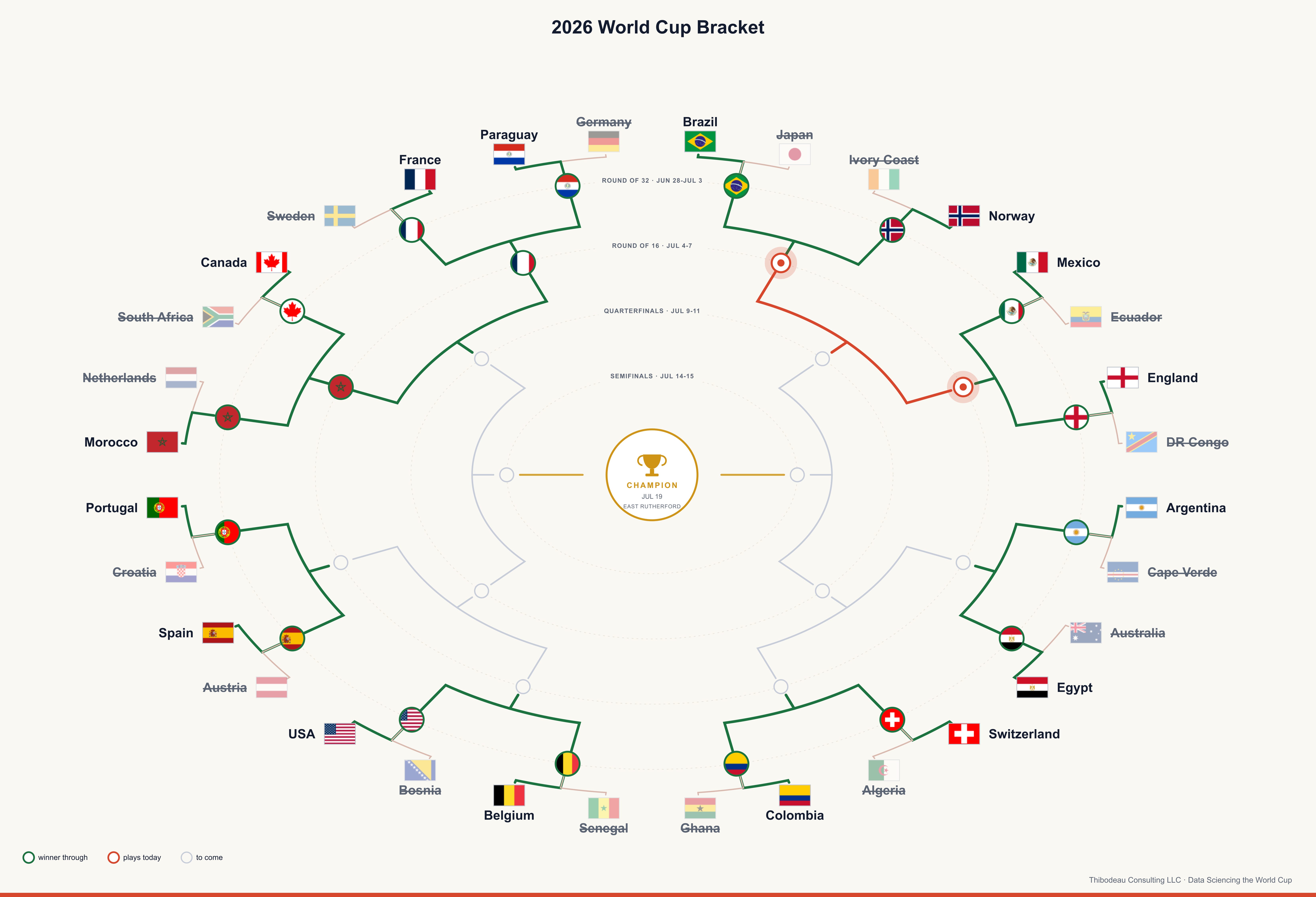
Yesterday did what the board said it should, though not the same way twice. First, Morocco ended Canada’s run, a 3-0 result that was closer than the scoreboard suggests. Canada’s coach said afterward he thought his team was better. Morocco, with the three goals, did not need to argue. They get France next. The French beat Paraguay 1-0 in the second game of the day on a 70th-minute Mbappé penalty. No shootout, no extra-time rescue, just two favorites through.
Question 25: How much should a model remember?
In the next set of posts, we are going into the model zoo. So far, we have spent much of the tournament testing ingredients: Elo, squad value, goal difference, market odds, futures, travel, heat, and group-stage form. Then we put some of them together in a simple logistic regression model.
Now we get to model architecture. Do fancier models actually beat plain ones? When? Why? And how do you know whether a clever model is learning something real, rather than memorizing the weirdness of past tournaments?
We’ll also get into concepts that help us decide whether a forecast is trustworthy: leakage, bias and variance, train-test splits, and why the model that looks best in the lab is not always the one you want before kickoff.
K-Nearest Neighbors: Similarity as a model
The first model is one of the most intuitive: k-nearest neighbors, or kNN. The idea is simple. To predict a new game, do not start by fitting a curve. Start by asking: which past games looked most like this one?
Suppose Brazil are playing Norway. A kNN model looks through the archive and finds the closest comparisons: games with a similar strength gap, similar recent form, similar rest. Then it asks what happened in those games. If the look-alikes mostly went to the favorite, the model leans favorite. If they were messy, low-confidence games, it stays cautious.
The k is how many neighbors the model asks. At k = 5, it listens to the five closest matches. At k = 500, it polls a much larger neighborhood. That choice is really a choice about memory. A tiny neighborhood remembers very specific cases, but it is jumpy. A huge neighborhood smooths away the noise, but it forgets what made tonight’s game distinctive.
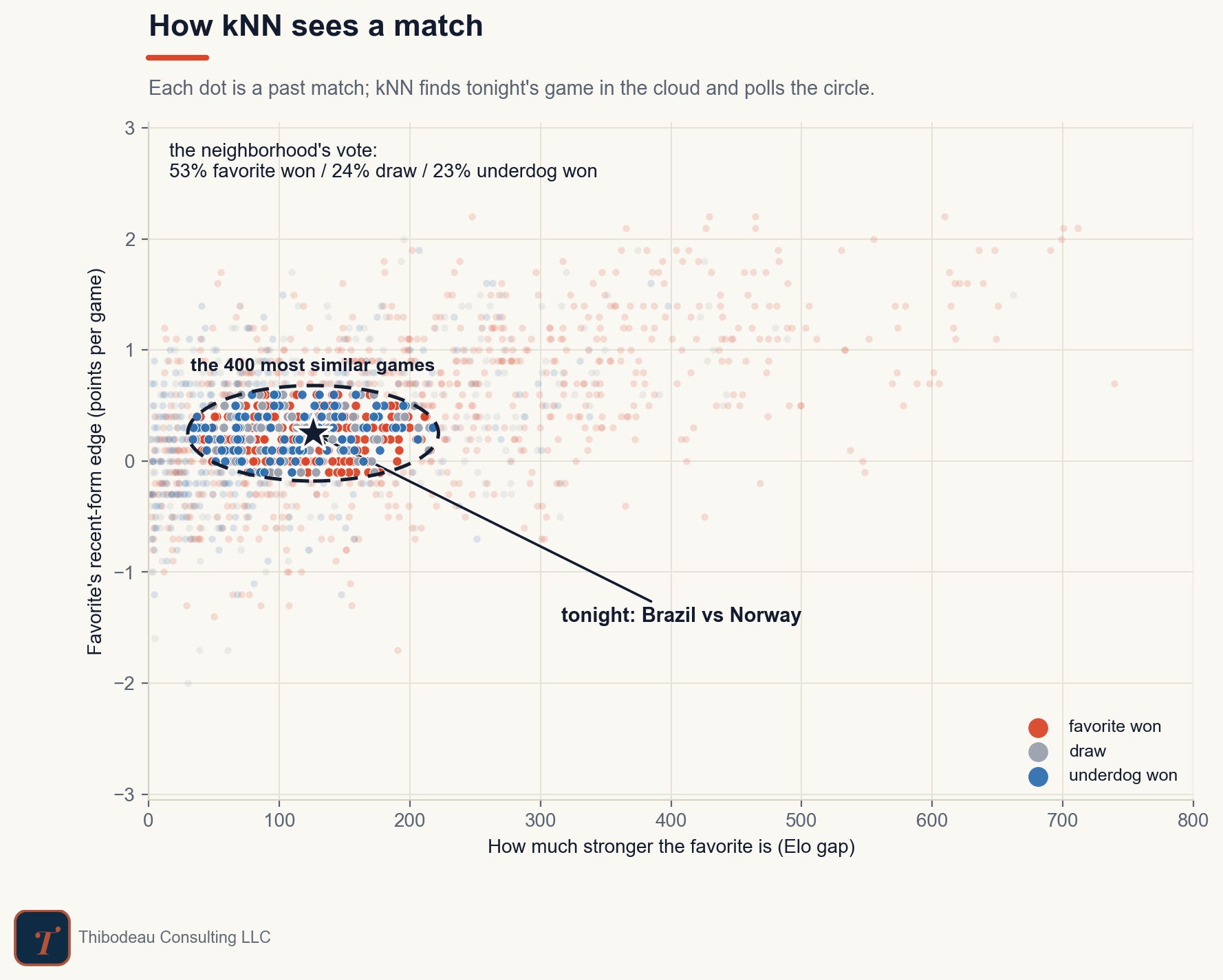
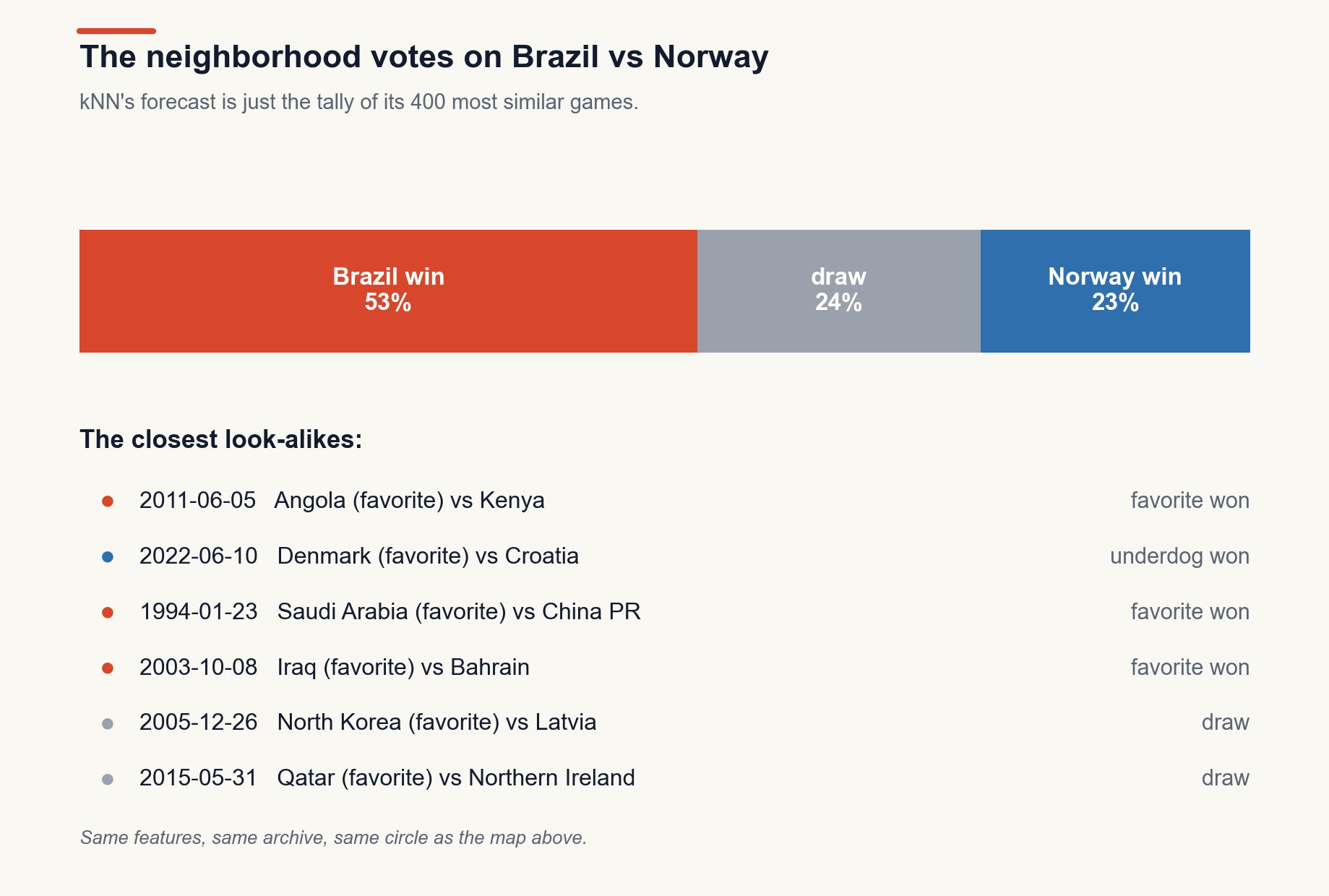
The first chart shows the intuition. Each dot is a past match, plotted on two features: how much stronger the favorite was, and the favorite’s edge in recent form. Tonight’s Brazil–Norway lands inside a cloud of games that look just like it on those two dimensions. The model draws a neighborhood around it and polls the outcomes inside. Here the neighborhood is the 400 most similar games, and the vote comes back: 53 percent favorite win, 24 percent draw, 23 percent underdog win. For comparison, the betting market has Brazil at 54.
The Brazil-Norway example shows why the model is intuitive. It is not producing a forecast from a hidden equation. It is tallying the closest look-alikes. In the 400 nearest games, the favorite won 53 percent, the match ended drawn 24 percent, and the underdog won 23 percent. The closest comparisons are not perfect twins; they are games like Angola-Kenya, Denmark-Croatia, Saudi Arabia-China PR, Iraq-Bahrain, North Korea-Latvia, and Qatar-Northern Ireland.
Features define the neighborhood
A kNN model only knows the features we give it, so it judges similarity through those features. Give it only team strength and home edge, and it finds games where the favorite looked about this strong in about this venue. Add recent form and rest, and it searches for a more specific kind of match. Add everything we track (goals scored and conceded, momentum, tournament context, etc) and it has to hunt for neighbors in a much higher-dimensional space.
One thing that is fun about machine learning is that we can test those choices instead of arguing about them. The next chart compares feature sets by forecast error. The simplest version, using only the Elo gap and home edge, does best. Adding form and rest costs a little. Throwing in all 20 available features makes the model worse.
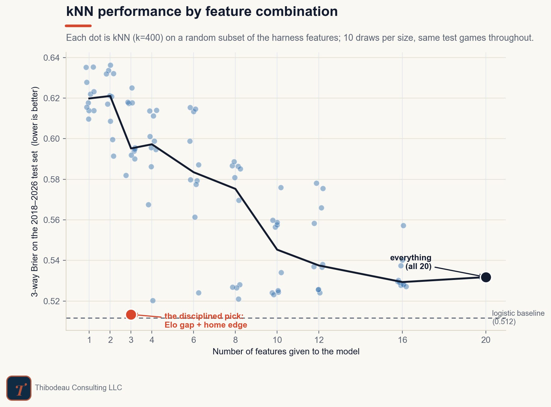
That is the first model-zoo lesson: complexity has to earn its place. A fancier definition of “similar” helps only if the extra dimensions carry real signal. Otherwise they just make it harder to find the right neighbors.
Features are only half the problem, though. Once we decide what similarity means, we still have to decide how much of it to use.
How much should it remember?
That is the k, and the chart shows the tradeoff. On the left, k is tiny. The model is polling only five or ten past games, and the error is high. That is over-memory: a few specific matches carry too much weight, and one strange result can pull the whole forecast around.
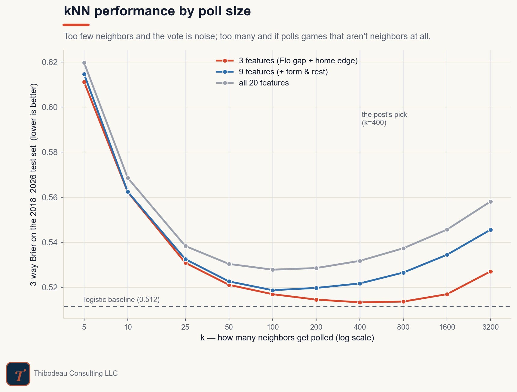
As k grows, the model improves quickly. By the time it is polling 100 or 200 neighbors, the forecasts are much steadier, and the best region is broad rather than exact. That breadth is useful. There is no magic in k = 400, our pick; it is simply the bottom of a wide, forgiving valley.
Then the curve bends back up. At very large values, the model is no longer asking “which games looked like this one?” It is asking “what usually happens in international soccer?” That adds stability, but it washes out the matchup. Too much memory becomes forgetfulness.
The feature lesson shows up again, too. The simplest version, using just the Elo gap and home edge, is the strongest line on the chart. Adding form and rest trails it slightly. Adding all 20 features is worse at every single k. More information only helps when it helps the model find better neighbors. Otherwise it just makes “nearest” harder to mean anything.
What kNN Teaches Us
kNN is useful because it makes the model tradeoff hard to miss. Remember too little, and the forecast becomes generic. Remember too much, and it starts chasing a few vivid old games. Add too few features, and it misses context. Add too many, and “similar” stops meaning much at all.
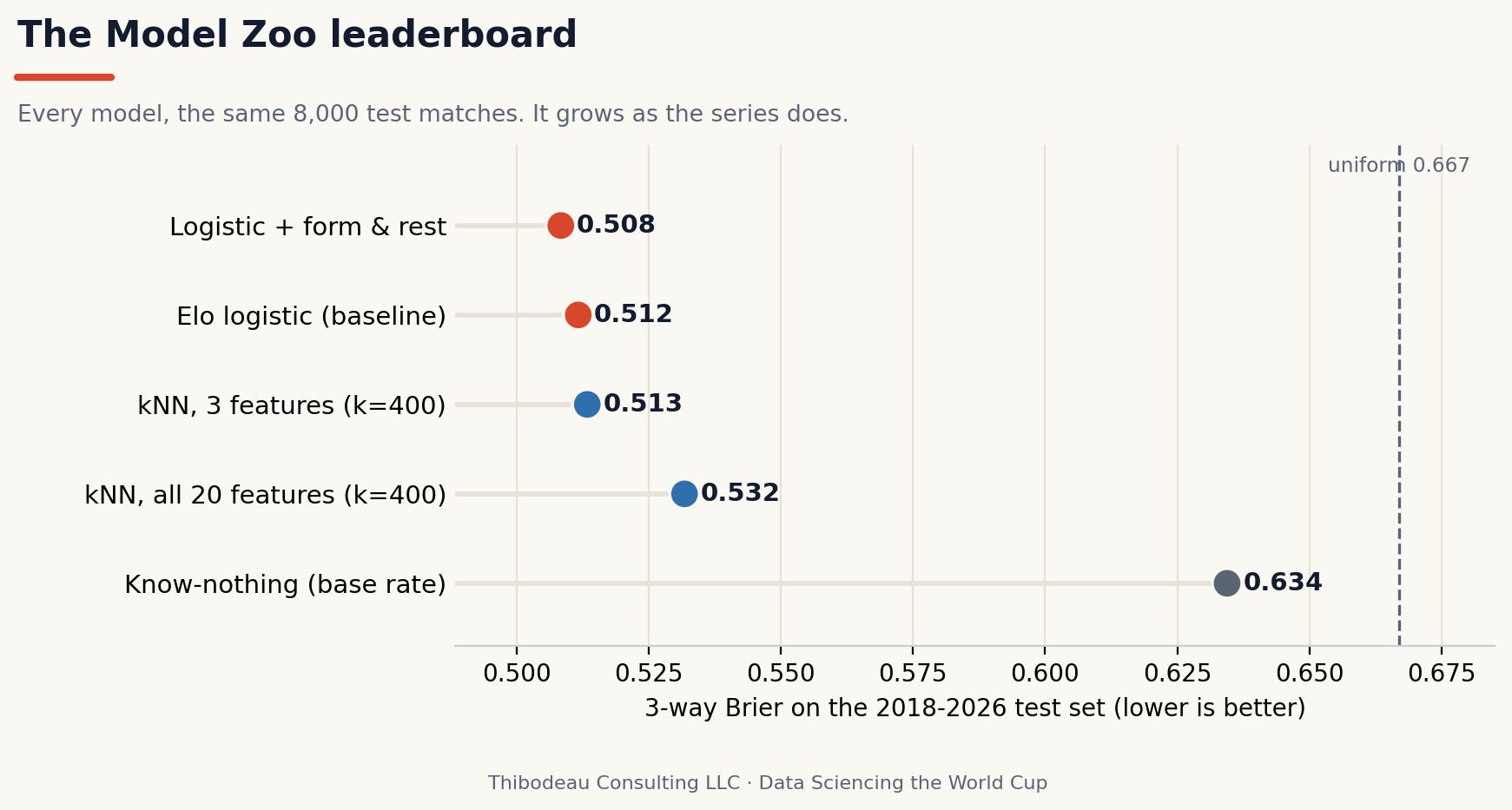
The leaderboard gives the verdict. The best kNN version, using three features and k = 400, finishes at 0.513 on the test set. That is basically tied with the Elo logistic baseline at 0.512, and just behind the logistic model with form and rest at 0.508. The overloaded kNN, with all 20 features, drops to 0.532.
So kNN does not win the zoo. But it teaches the zoo’s first rule: complexity is not free.
Today’s Scorecard and Forecasts
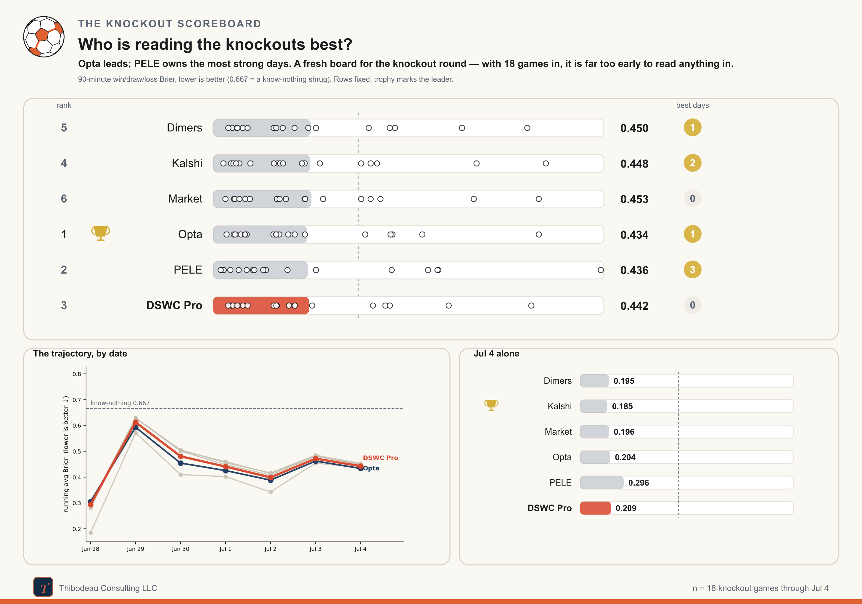
Yesterday went to the favorites, which made it a bad day to be cautious. Kalshi won the slate at 0.185, just ahead of Dimers and the market. PELE, which had been softer on both Morocco and France, had the roughest day.
Through 18 knockout games, the race has tightened. Opta has moved into first at 0.434, PELE is right behind at 0.436, and DSWC Pro sits third at 0.442. Kalshi, Dimers, and the market are all clustered just behind them, between 0.448 and 0.453. The spread from first to sixth is only about two hundredths of a Brier point, and 18 games is still a thin sample, but the early PELE lead has turned into a real race.
Today’s card is more interesting than yesterday’s. Brazil are favored over Norway, but not safely enough to ignore Haaland. Mexico-England is the sharper split: most of the board leans England in regulation, while PELE makes Mexico the likelier winner. So the late game is the clean model test: consensus says England; PELE says altitude, defense, and home turf matter more.